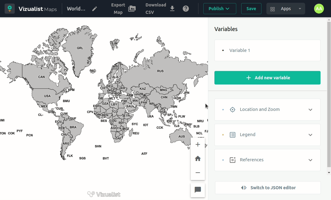
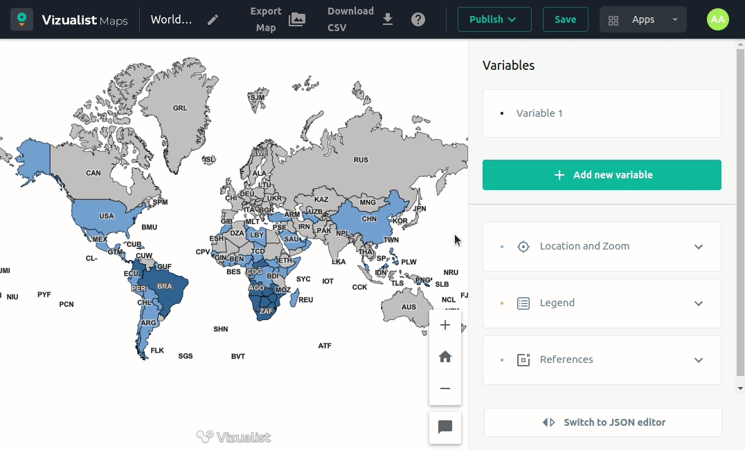
Data and map style
To add data and style, click on the variable you want to edit.
Visualize as
Choropleth is a type of thematic map in which a set of predefined geographic areas is colored or patterned in proportion to a statistical variable (e.g., population density or per-capita income).
Color by
Select the statistical variable from your dataset that will be used in coloring your map visualization.
Color Palette
Choose one of the palettes to color your map.
-
Go to the variable you want to add or change the color palette.
-
Click on the palette.
-
Choose a color palette from the list.
You can switch the palette from lighter to darker and vice versa by clicking on the swap icon ![]() .
.

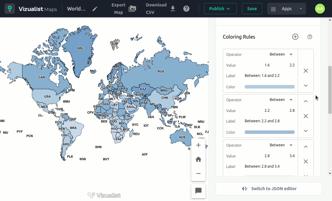
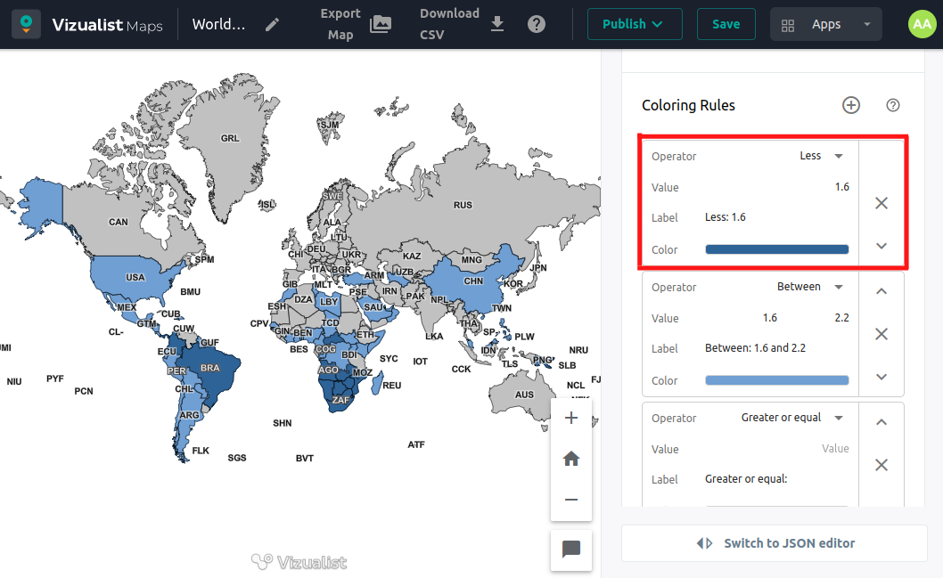
Coloring rules
Coloring rules are prepared by default, but you can edit them and show values within a specified range with the same color. Use different operators, set preferred values, labels, and colors, and move them up and down until you are happy with your map visualization.
Add coloring rule
Simply add a rule by clicking the add button next to the coloring rules section name.
Edit coloring rules
You can choose operator, value, label, and color in every rule.
Move coloring rules
If you decide you want a different order for your rules, use the Move up or Move down button on the right side of the rule box.
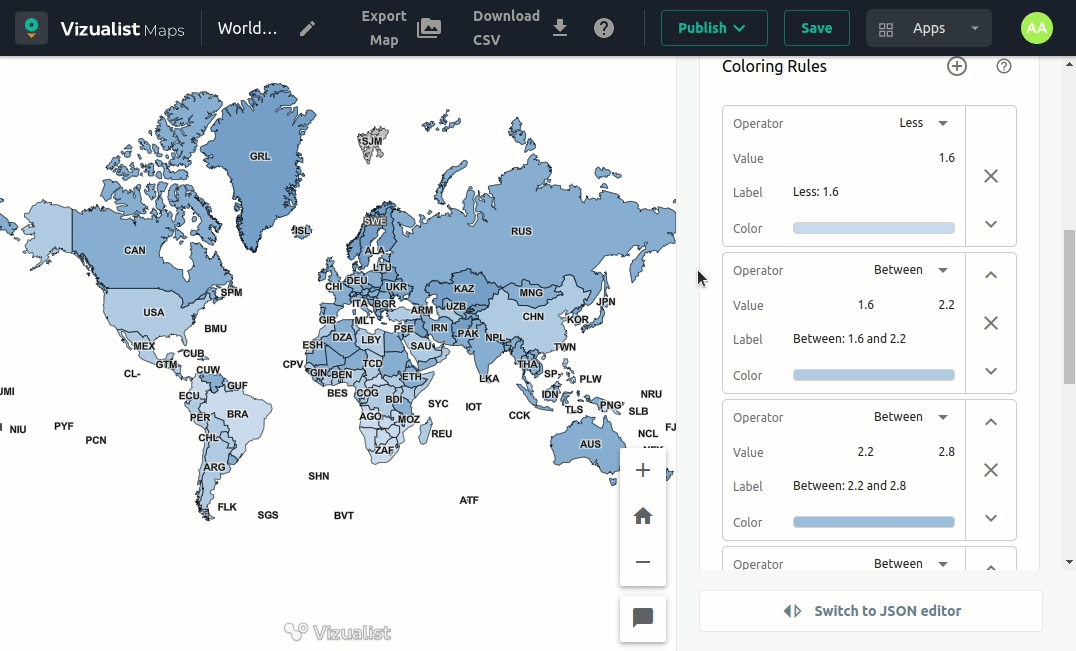
Remove coloring rule
If you add more than you wanted rules or decide you don’t need one, simply click on the Remove rule button on the right side of the rule box.
Once you delete the rule, there is no revert option. But you can create a new rule again.